
.png)
If you own digital accessibility at your institution, you already know the tooling. You can open a file and get a verdict on that file. What you can't get is the answer your provost would actually ask: how accessible is this institution, and is it getting better or worse?
That gap is why accessibility work stays invisible. Leadership has never had a number they could read.
Here is the sharpest way one accessibility director put it to her faculty: a course sitting at 50% doesn't mean the course is half compliant. It means that for some of your students, only half the material is actually there. The other half may as well not exist. Once faculty hear the score that way, it becomes a description of how much of their teaching is actually reaching students.

That's why the score matters. It moves the unit of measurement from the file to the institution, and it puts teaching at the center. The CampusMind Score does exactly that: one number for the institution, built from every course and every document, refreshed as content changes.
Most accessibility conversations ask faculty to learn a new vocabulary. Contrast ratios, alt text, heading structure, WCAG levels. None of it is what they trained to teach. They nod, and nothing changes.
A score cuts through that. Show a faculty member a course sitting at 72 and you don't have to explain what it means. 72 is a C. In a room of educators, a grade never needs translation. Once a course has a grade, faculty behave the way they behave with any grade: they want it higher.
The score also separates the number from the person. A low score triggers a conversation and help from the accessibility team, never a write-up. That's the version of visibility faculty will actually cooperate with, and it's what lets the number reach the rest of the campus.
Once faculty are reading their scores, department chairs start asking to see the department roll-up, because chairs want to know how their department compares to the one down the hall. Then deans ask for the college view, because they want to know how their college compares to the others. Then the provost's office starts asking, because at that point it's a number that describes the whole institution.
None of that requires a policy. A score is the first accessibility artifact that different roles can compare against each other. A file check is meaningless to a dean. A course-level score is not.
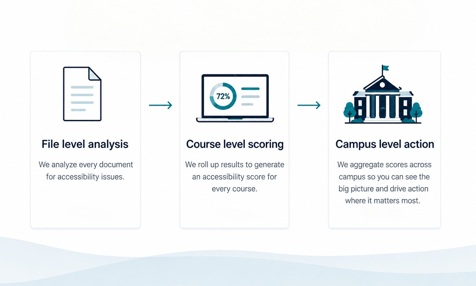
At the provost's level, the score lands next to the number every provost already watches: retention. And accessibility connects to retention directly. Students who use the accommodations they were referred to retain at higher rates than students who were referred and never followed through. One accessibility team reported a 10 to 15 percent lift in early-term retention between the two groups. That's the kind of connection a provost's office can act on, and once the score is on the same dashboard as retention, nobody has to argue for it.
Now every level of the institution has a reason to look at the number. It needs one more thing to keep working, which is a way to be governed.
An average lies. A campus can sit at 97% overall while one course fails on every file. So the institutions that get the most out of their score set a floor per item, not per average: every single file in every course clears 90%. That floor gets reviewed monthly, in a standing committee where the provost has a seat, with the same report going to every dean and chair.
Measure. Review. Support. Improve. Monitor. That's a governed metric.
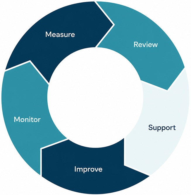
Measure is a live score across every file and every course, refreshed as content changes.
Review is a standing monthly meeting where deans, chairs, and the provost see the same report.
Support is a low score triggering help from the accessibility team, never a write-up.
Improve is what the numbers do once the first three are in place
Monitor is what keeps the loop alive: new documents arrive every term, so a cleared backlog refills. A score that refreshes with content is what carries the work across a leadership change, a new LMS, or the next OCR complaint.
The loop already fits your campus. What's missing is the number to start it. The CampusMind Score is that number, live from day one.